America's Labor Force Is Reshuffling: The Metros Winning and Losing Workers in 2026
Labor force growth is one of the strongest leading indicators for apartment demand. This analysis ranks 163 major U.S. metros by one-year labor force growth using the latest BLS data.
The spread runs from +5.5% (Myrtle Beach, SC) to -4.1% (Kalamazoo, MI), a nearly 10-percentage-point gap. South Carolina places three metros in the Top 15. Michigan places four in the Bottom 5.
We also examine the gap between labor force growth and employment growth to identify which markets are tightening versus loosening, a signal that matters for multifamily occupancy projections.
Why Labor Force Growth Matters for Apartment Demand
More workers in a metro means more paychecks, more households formed, and more leases signed. When the labor force contracts, vacancies rise, and rents soften, often before the headline employment numbers catch up.
We analyzed one-year labor force growth across 163 ranked metros using BLS data. The average across all ranked metros is +0.7%, with roughly 40 metros posting outright labor force declines.
The 15 Metros Gaining Workers Fastest
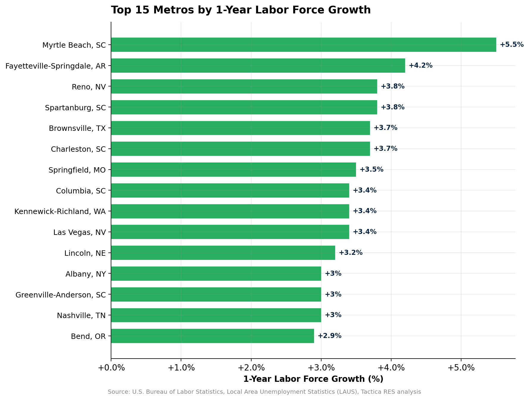
South Carolina places three metros in the Top 15: Myrtle Beach (+5.5%), Spartanburg (+3.8%), and Charleston (+3.7%). Nevada adds two, with Reno (+3.8%) and Las Vegas (+3.4%). The Southeast and Mountain West dominate the leaderboard, with only Lincoln, Nebraska, breaking through as a Midwest exception.
What is notable is how closely labor force growth tracks employment growth in the top performers. Myrtle Beach shows a 1.2-percentage-point gap between labor force growth (5.5%) and employment growth (4.3%), which contributes to its elevated 5.9% unemployment rate. But both figures are among the strongest in the country. The gap is worth monitoring, but the sheer volume of growth in both measures puts Myrtle Beach in a fundamentally different category than metros where both numbers are contracting.
Springfield, MO, shows a perfect match: +3.5% on both measures with just 2.9% unemployment.
For multifamily investors, the top gainers represent the demand side of the equation. More workers mean more renters. But labor force growth alone does not guarantee rent growth. As documented in the analysis of the 25 metros with falling rents, several of these same markets (Las Vegas, Phoenix) are seeing rent declines due to supply overshoots. The investment thesis depends on whether demand growth will outpace supply deliveries.
The 15 Metros Losing Workers Fastest
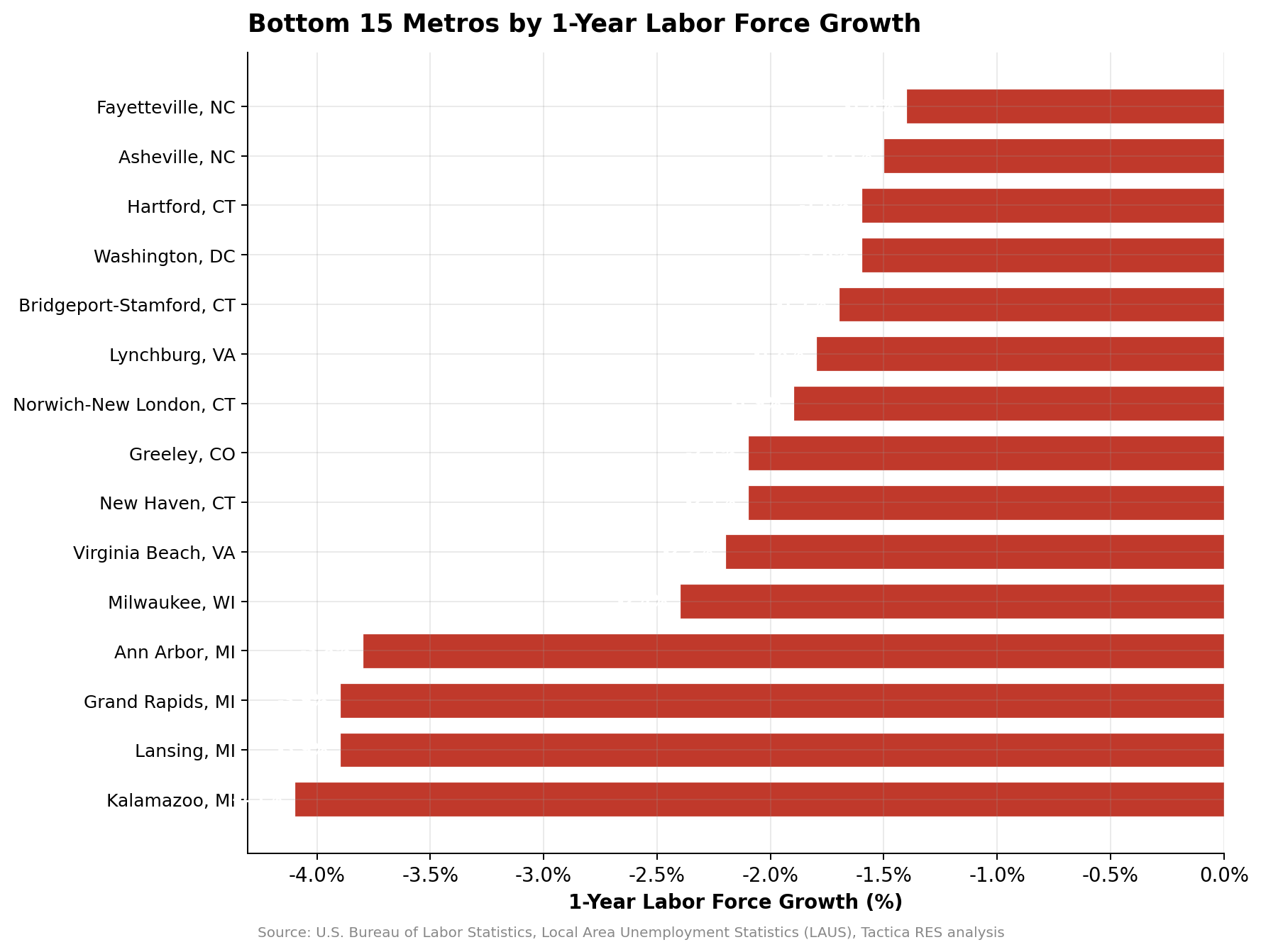
Michigan dominates the wrong end of this list. Kalamazoo (-4.1%), Grand Rapids (-3.9%), Lansing (-3.9%), and Ann Arbor (-3.8%) are all shedding workers at rates far exceeding the national average. This is not a seasonal blip. It represents a meaningful structural shift in Michigan's labor market.
Connecticut joins Michigan with three entries: New Haven (-2.1%), Norwich-New London (-1.9%), and Hartford (-1.6%). The Virginia-DC corridor also shows weakness, with Virginia Beach (-2.2%), Washington, D.C. (-1.6%), and Lynchburg (-1.8%) all contracting.
What makes the Michigan story particularly concerning is that population growth in these metros is actually positive (Kalamazoo: +1.0%, Grand Rapids: +1.4%, Ann Arbor: +2.3%). People are moving in, but they are not entering the local workforce. Local labor force contraction means fewer local paychecks supporting rents and less demand for commercial real estate of all types.
Labor Force Growth vs. Employment Growth: The Gap Matters
When labor force growth outpaces employment growth, unemployment rises. When employment growth exceeds labor force growth, the job market is tightening. That gap is the signal investors should watch.
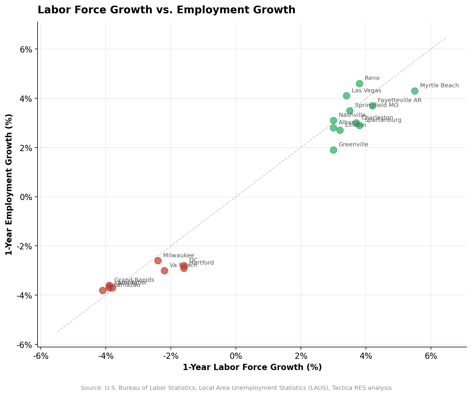
Nashville shows balanced growth: +3.0% labor force matched by +3.1% employment growth with 2.9% unemployment. These are healthy, balanced labor markets where the creation of new demand is real.
Contrast that with Myrtle Beach, where the labor force is growing at 5.5%, but employment is only 4.3%. The 1.2-percentage-point gap helps explain Myrtle Beach's elevated unemployment rate of 5.9%. Workers are arriving faster than jobs are materializing, a dynamic that creates short-term rental demand but may not sustain it.
The State-Level Patterns
South Carolina is the standout winner with every ranked metro posting positive labor force growth. Michigan is the standout loser with every metro in decline. Connecticut and Virginia show broad-based weakness. Nevada, Arkansas, and Tennessee show broad-based strength.
These state-level patterns matter for portfolio construction. Multifamily investors concentrated in Michigan face a systemic labor demand headwind that no property-level strategy can fully overcome. Conversely, investors in South Carolina markets are benefiting from a labor tailwind that supports occupancy and rent growth across the board. This is a key insight for anyone deploying capital into commercial real estate in the Southeast.
Full Rankings: 15 Best and 15 Worst
| # | Metro | LF 1Y | Emp 1Y | Pop 1Y | Unemp |
|---|---|---|---|---|---|
| Top 15 — Gaining Workers | |||||
| 1 | Myrtle Beach, SC | +5.5% | +4.3% | +4.0% | 5.9% |
| 2 | Fayetteville-Springdale, AR | +4.2% | +3.7% | +2.6% | 3.1% |
| 3 | Reno, NV | +3.8% | +4.6% | +1.9% | 4.0% |
| 4 | Spartanburg, SC | +3.8% | +2.9% | +3.3% | 4.9% |
| 5 | Brownsville-Harlingen, TX | +3.7% | +2.1% | +1.2% | 6.4% |
| 6 | Charleston, SC | +3.7% | +3.0% | +2.4% | 4.1% |
| 7 | Springfield, MO | +3.5% | +3.5% | +1.9% | 2.9% |
| 8 | Columbia, SC | +3.4% | +2.5% | +1.7% | 4.7% |
| 9 | Kennewick-Richland, WA | +3.4% | +3.2% | +1.6% | 5.8% |
| 10 | Las Vegas, NV | +3.4% | +4.1% | +2.7% | 5.2% |
| 11 | Lincoln, NE | +3.2% | +2.7% | +2.4% | 2.8% |
| 12 | Albany, NY | +3.0% | +2.8% | +1.0% | 3.3% |
| 13 | Greenville-Anderson, SC | +3.0% | +1.9% | +2.2% | 4.6% |
| 14 | Nashville, TN | +3.0% | +3.1% | +2.3% | 2.9% |
| 15 | Bend, OR | +2.9% | +2.2% | +1.3% | 5.0% |
| Bottom 15 — Losing Workers | |||||
| 149 | Fayetteville, NC | -1.4% | -1.6% | +0.4% | 4.3% |
| 150 | Asheville, NC | -1.5% | +0.7% | +1.2% | 3.2% |
| 151 | Hartford, CT | -1.6% | -2.9% | +1.5% | 4.1% |
| 152 | Washington, DC | -1.6% | -2.8% | +2.1% | 3.8% |
| 153 | Bridgeport-Stamford, CT | -1.7% | -3.0% | +2.2% | 3.9% |
| 154 | Lynchburg, VA | -1.8% | -2.6% | +0.7% | 3.6% |
| 155 | Norwich-New London, CT | -1.9% | -3.3% | +1.1% | 4.0% |
| 156 | Greeley, CO | -2.1% | -1.3% | +2.9% | 4.0% |
| 157 | New Haven, CT | -2.1% | -3.4% | +1.5% | 4.0% |
| 158 | Virginia Beach-Norfolk, VA | -2.2% | -3.0% | +0.8% | 3.6% |
| 159 | Milwaukee, WI | -2.4% | -2.6% | +0.9% | 3.1% |
| 160 | Ann Arbor, MI | -3.8% | -3.7% | +2.3% | 3.7% |
| 161 | Grand Rapids, MI | -3.9% | -3.6% | +1.4% | 4.0% |
| 162 | Lansing, MI | -3.9% | -3.7% | +1.4% | 4.4% |
| 163 | Kalamazoo, MI | -4.1% | -3.8% | +1.0% | 4.2% |