Tactica RES Labor Statistics Interactive Dashboard: FAQ
This blog post is meant to explain common questions about the Labor Statistics Dashboard. We’ll cover each dashboard page and discuss definitions, best uses, and calculation logic.
The BLS Dashboard is helpful when doing submarket research for a real estate investment.
State Labor Statistics
Where is this information coming from?
The Bureau of Labor Statistics website (bls.gov).
Why is some data limited to just the state while others will be far more granular at the metropolitan, county, and city levels?
Our dashboard is limited to what data BLS publishes. I wrote a separate blog post explaining nine different metrics BLS measures and whether the information is:
State-Level
Local-Area-Level (metropolitan, county, city)
Historical
For some metrics, BLS will only provide the current data (such as wage information) and not offer any historical wage information, making historical trend analysis impossible.
Labels are confusing. What are the "Non-Institutionalized Population," "Labor Force Participation Rate," and "Employer Participation Rate?"
I wrote a separate blog post dedicated to defining all these metrics. I would advise you to spend five minutes reviewing each metric to understand its calculation and the depth of data BLS provides for a given metric.
Why doesn't the top row of data update when I change the Date Range?
This row is the most current data and isn’t affected by adjusting the data range.
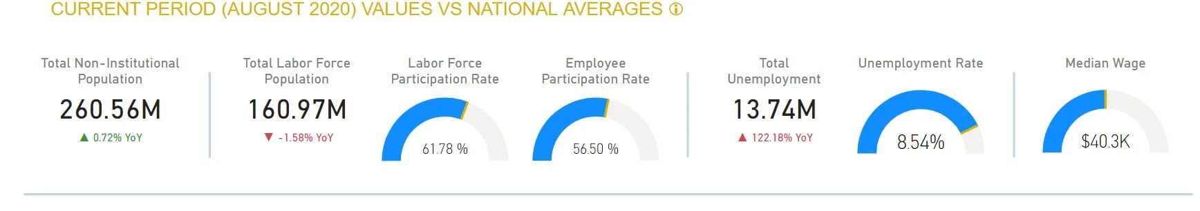
All KPIs and gauges show the latest data at the national or state level (depending on what state(s) you have selected). The Date Range will affect all KPIs and the chart below the horizontal line.
What is the gold bar in the gauges?
The national average. You can hover over the gold bar to see the national average and how your selected state compares.
What is "YoY"?
Year-over-Year. All current metrics presented in the top row display the increase or decrease that has taken place over the last 12 months.
What is "PoP"?
Period-over-period growth/decline. You have complete control over the period you want to be calculated for the metrics presented on the bottom section of this page. The increase or decrease in population, labor force population, and gross unemployment is calculated as "period-over-period" for the custom date range you select via the slider.
Example: You select the date range 8/2/2014 – 8/31/2020 and "check" California from the State Selection list.
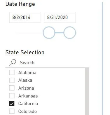
Let’s focus on population for a minute.

California's population has increased by 4.08% (from 30 million to 31.2 million). Over this same period, the national average has been 4.98%, which means California is trailing the national average by 0.89%.
Labor Force Population and Gross Unemployment can be analyzed in the same way. The graph to the right will show you what happens over the entire time series with population, labor force, and unemployment numbers.

Why doesn’t the date slider land on the exact data I am trying to target?
You can manually type in whatever date range you want. The slider is just for convenience, but it may be hard to hit the exact day, given the long time horizon of the data.
Any Other Helpful Tips?
Right-click the line chart above and select “Show as Table.” All the historical data in table form to view the monthly gross details.
Page 2: Historical Comparison
How can I quickly select cities, counties, or MSAs?
Searching for a city under the Region Selection box is the way to go. Type your city in the search and check it. When I type in “Los Angeles,” it will give me multiple options for Los Angeles, the city, or variations of the LA metro. Check whatever applies and repeat for as many regions as you want.

It’s worth noting that your selections will stay selected as you toggle between labor force, employment, and unemployment data.
Shouldn't YoY Growth at the bottom of the page equal the same growth as 2020/2019?
No. It's essential to understand how these calculations vary.
Example: Let's select Maryland as our state and focus on the Baltimore Metro.
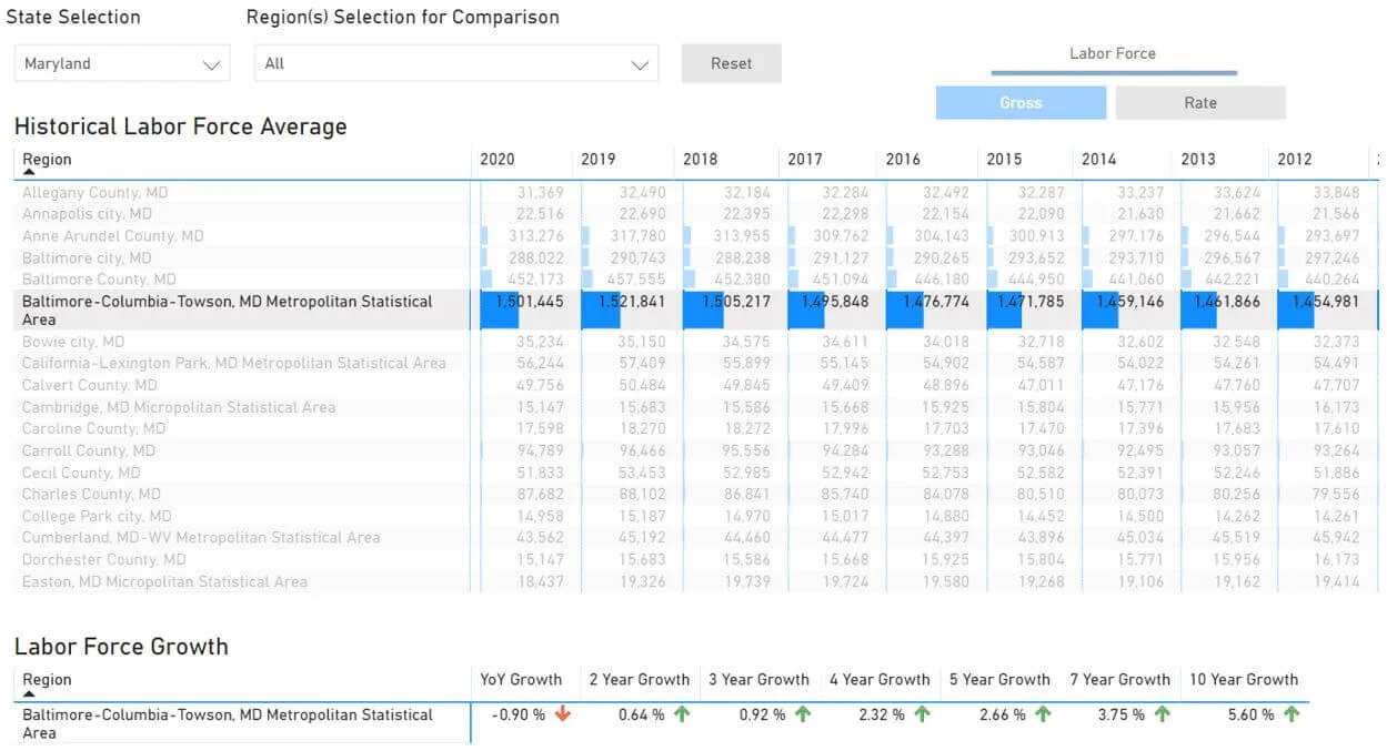
You can see the YoY Labor Force Growth is -0.90%.
If we take the:
2020 Labor Force / 2019 Labor Force
1,501,445 / 1,521,841 = -1.3%
It's different, and here's why:
The image below shows the raw data coming directly from the BLS website.

The "(P)" in August of 2020 means "preliminary." The Tactica dashboard is still counting this data and will update once it is finalized.
The annual gross data in the Tactica Dashboard presents the labor force as the monthly average of each month in the year. In 2019, the monthly labor forces were:

A simple Excel "average" formula on the highlighted cells will calculate the 1,521,841.
The 2020 average labor force is calculated the same, albeit there is not a full year of data yet.

This same logic applies to gross employment, unemployment, and unemployment rate data.
The YoY calculations at the bottom of the page are different. Using the same data set, the dashboard divides the latest month of data (August) by August of the previous year.
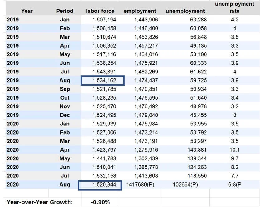
$1,520,344 / $1,534,166 - 1 = -0.90%
This same logic applies to gross employment, unemployment, and unemployment rate data.
Why does the dashboard only display state-level data when clicking on the labor force rate and employment rate?
Unfortunately, BLS only provides labor force participation and employee participation rates at the state level.
Pg. 3: Regional Comparison
How can I quickly select cities, counties, or MSAs?
Searching a city under the Region Selection box is the way to go. Type your city in the search and check it. When I type in “Chicago,” it will give me multiple options for Chicago, the city, different parts of Chicago, or the Chicago metro. Check whatever applies and repeat for as many regions as you want.

It’s worth noting that your selections will stay selected as you toggle between labor force, employment, and unemployment data.
Pg. 4: Wage Analysis
Can you explain the Wage Distribution Chart by Occupation and Location Chart?
Before clicking anything, you will see each state and the table details:
State Employment Totals
State Employment as Percentage of Total U.S Employment
State Wage Rank
State Median Wage
If you further drill down into a specific state, say Washington, you'll see the local intel.
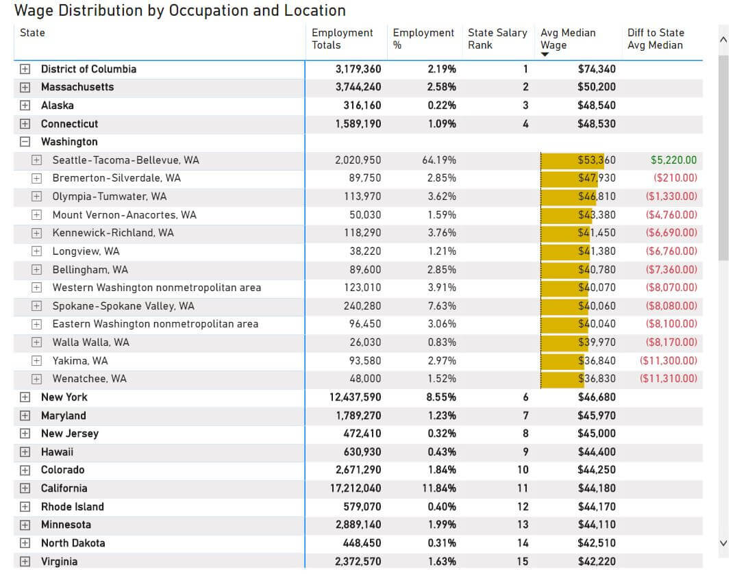
For each metro, county, or city, you'll see:
Regional Employment Totals
Regional Employment as a Percentage of Total State Employment
Regional Median Wage
The Difference in Regional Median Wage to State Median Wage
Drilling down even further, you will see occupation data at the regional level. Let's look at Seattle.
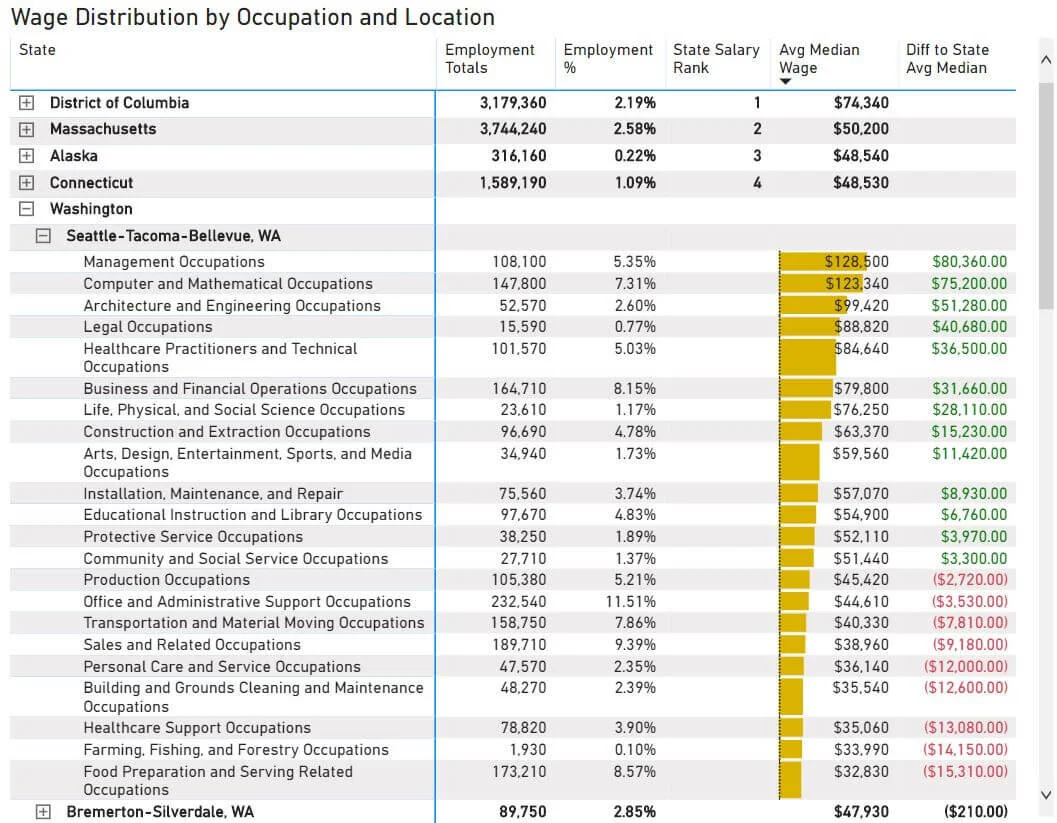
At the regional level, the table will summarize
Employees per Occupation
Occupation as a Percentage of Total Regional Employment
Occupation Median Wage
The Difference in Occupation Median Wage to State Median Wage