Automating Excel Charts with the Offset Function
A superb use for the offset function is creating dynamic charts. Part I of our offset tutorial discussed the benefits of offsets in financial modeling. This blog post will be solely dedicated to creating automated graphics that update automatically as your inputs change.
Contents
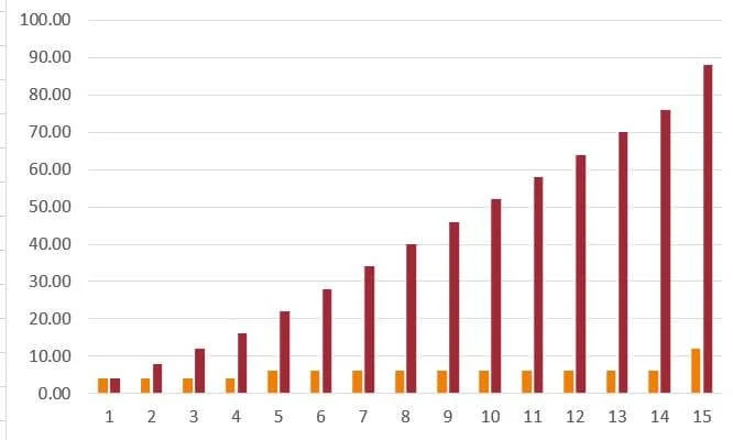
We are going to continue using the Redevelopment Model as an example. On the "Reno Summary" tab, I have a couple of charts that detail the renovation progress. Let's look at the "Renovation Summary" chart.
Creating Dynamic Charts with the Offset Formula
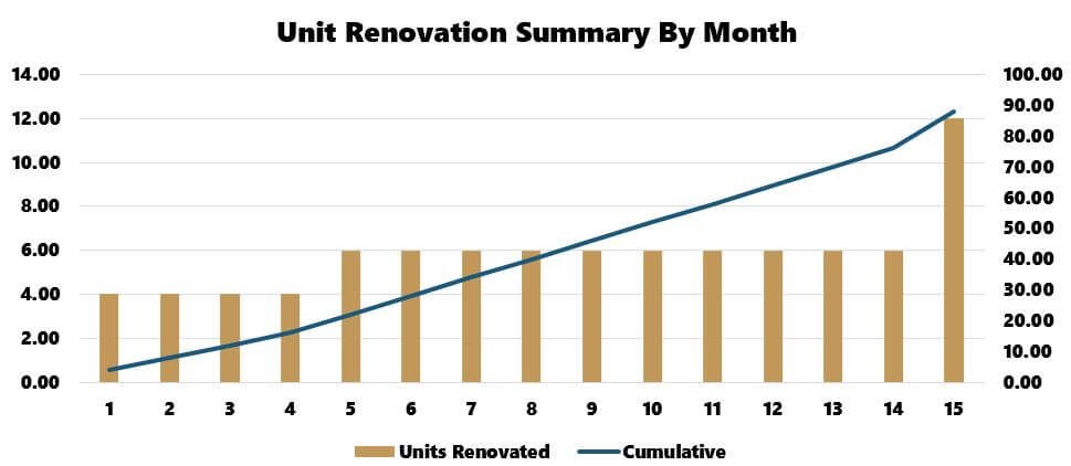
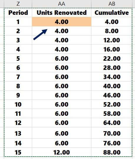
This chart summarizes monthly unit renovations on the first axis and tracks cumulative renovations on the second axis.
No matter what I do in the model with renovation timing, labeling, etc., this chart will update automatically and not require manual adjustment from the Excel user. This is made possible with named ranges made dynamic with the offset function.
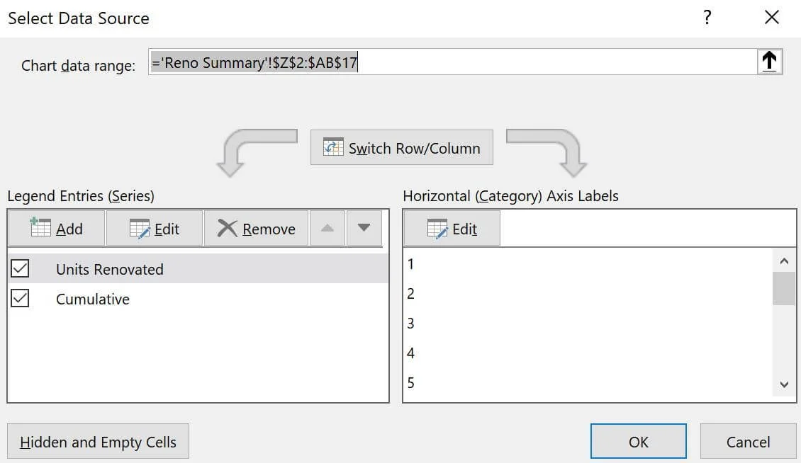
When I right-click on the chart, click "select data," and press enter, the screen moves to where the data is hosted on the far right of the worksheet.

This data table has 132 rows. However, Excel knows to only grab the chart data through Month 15 thanks to an offset formula.
When we right-click the chart and “select data,” there are three variables in this chart:
Units Renovated
Cumulative Units Renovated
Months (Horizontal Axis)
For each of these bullets, I made a dynamic named range that would only grab the data when the renovation is complete and will update immediately as I change underlying assumptions within the model.
Dynamic Named Ranges
I’ll start from scratch to show you how to make a dynamic chart variable. Let's start with creating three dynamic named ranges for:
Units Renovated
Cumulative Units Renovated
Months Horizontal Axis
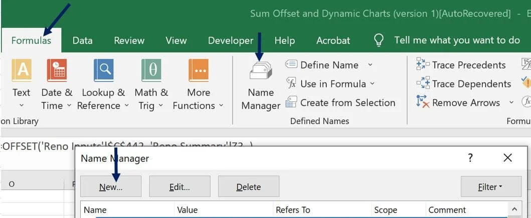
Go to Formulas > Name Manager > New
Units Renovated
I’ll name this range: "UnitsRenovated."
I then use the offset formula to stipulate what data I want the named range to reference.
=Offset($AA$3, , ,$M$4, )
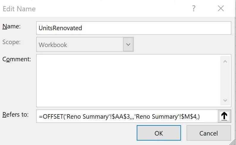
The only arguments I use in the offset formula are the reference cell and the height. All other arguments are left blank. AA3 is the reference cell highlighted below.
Height is stipulated by cell M4, summarized in the reno timeframe section of the worksheet (15-month renovation timeframe).

I’m going to follow the same process to create named ranges for:
Cumulative Units Renovated
Months Horizontal Axis
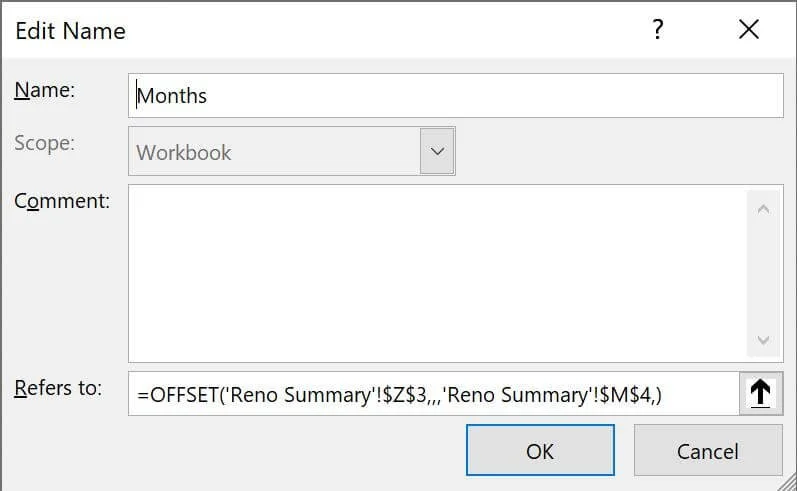
I will continue to use cell M4 (15 months) as the "height" argument, but I will switch the reference cell to:
AAB3 = Cumulative Units Reference Cell
Z3 = Period (Months) Reference Cell
Cumulative Units

Period (Months) Named Range:
Now, I can use these newly created named ranges in my chart that automatically adjust with the model inputs.
Let’s start with a fresh blank chart.
Insert > 2-D Column Chart
I’ll immediately Right-click the newly created chart and click “Select data.” Everything is blank like below:
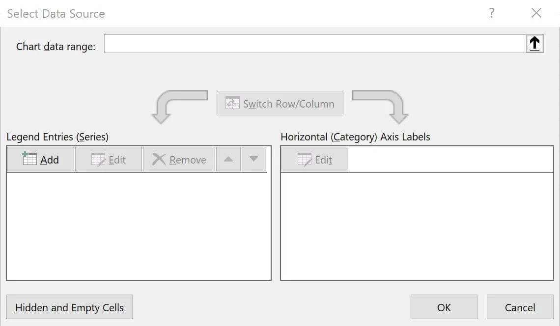
I will first add two entries on the left by selecting “Add.”
Units Renovated
Cumulative Units Renovated
To do so correctly, you need to enter the ‘worksheet,’ followed by an "!" followed by the named range:
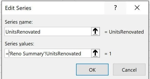
=‘Reno Summary’!UnitsRenovated
Click "OK."
You’ll be at the main “Select Data Source Window” again.
Follow the same steps with Cumulative Units Renovated.
First, click “Add.”
Then the series value: = ‘Reno Summary’!Cumulative
Click “Ok.”
You’ll be at the main “Select Data Source Window” again.
Click “Edit.” on the “Horizontal (Category) Axis Labels (left side)
Then enter the series value: = ‘Reno Summary’!Months
Click “Ok.”
You can exit the “Select Data Source” screen.
While the chart is not yet formatted, all the pertinent data has been added.
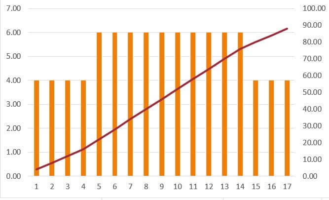
The final step is to right-click the chart and “change chart type.” I will make it a combo chart with a secondary axis from there.

Except for coloring and labels, the chart mimics what I created before. If I play with renovation assumptions and stretch the renovation out to 17 months, the chart updates automatically with no manual updates!
Video: Automating Excel Charts
Summarizing Offset Function in Excel
Reference functions like the offset can enable more efficient analysis in your Excel workbook. Part I gave two examples of using the offset formula in a real estate modeling scenario. This article covered how to automate your Excel graphics using offset.
A direct cell function (= cell) may work in the short term and be a more straightforward solution. However, the offset function is how Excel pros reference cell(s) and ensure longstanding precision and accuracy in a changing workbook environment with vast inputs.
Tactica uses the offset function consistently for:
Superior data presentation
Data aggregation
Dynamic charts & graphics
Learning the offset syntax and its best uses is an absolute game-changer if you spend much time in Microsoft Excel.