The 8 Best Job Markets in the US: Measured By Covid Resiliency
Usually, when you open an article about the best cities for employment, you expect to see the author focus on the usual suspects:
San Francisco, California
Boston, Massachusetts
Austin, Texas
Seattle, Washington
Phoenix, Arizona
Dallas, Texas
Denver, Colorado
Above are examples of U.S. cities that epitomized abundant job opportunities for the last decade and have been trendy metro areas for residents, businesses, and investments. But then a pandemic happened, and as real estate investors, job seekers, and researchers, we must adjust the lens through which we analyze urban centers and determine if the status quo has changed.
Measuring the Top Job Markets
To determine our list of the eight best employment markets, we used labor statistics provided by The Bureau of Labor Statistics (BLS). The BLS tracks critical regional economic metrics such as:
Gross Employment
Gross Labor Force
Unemployment Rates
We took it upon ourselves to analyze this data, uncover the historical trends, and figure out which metropolitan statistical areas (MSA) stand apart from the nation during the coronavirus pandemic.
We laid out three criteria:
MSA year-over-year employment growth in the U.S. Top 11
MSA year-over-year labor force growth in the U.S. Top 11
MSA unemployment rate is less than the national unemployment rate
Disclaimer: We discontinued our interactive dashboard that utilizes the BLS data. All images depicted in this article were snapshots from this former tool.
Criteria 1: Employment Growth
Job growth is essential. Criteria #1 will examine gross employment in September 2020 vs. September 2019. Comparing this year to last year is powerful because most cities around the country have seen a significant decline. The fundamentals were solid in 2019, and finding MSAs that have not only stood pat during COVID but have grown their employment base is robust.
Criteria 2: Labor Force Growth
Labor force participation is underrated, in my opinion. So many of the headlines are focused on the unemployment rate. We discussed why the unemployment rate requires discretion in the article "Tracking Unemployment Trends." We've seen that unemployment has been dropping lately, but in many instances, the labor force is dropping (unemployed persons are giving up). Seeking out the markets with an increasing labor force proves that this phenomenon isn't skewing the unemployment data.
Criteria 3: Unemployment Rate
While I don't consider the unemployment rate the "tell-all" metric, it's still important to assess. Suppose I saw a market exhibiting strong employment and labor force growth but unemployment well over the national average. In that case, I'd worry that the unemployment rate is a leading indicator of a future decrease in employment and the labor force.
The Dover, Delaware MSA is a market that exhibits this trait. It falls right outside the Top 10 in year-over-year employment growth, is #2 in year-over-year labor force growth, but has an unemployment rate of 8.67%, well above the national average in September. If I look at the monthly data, the labor force dropped over 2% from August to September, which isn't surprising given the high unemployment.
The Analysis
First, I want to filter all my data to include only metropolitan areas. If I don't do this, thousands of cities, counties, and MSAs will be included.
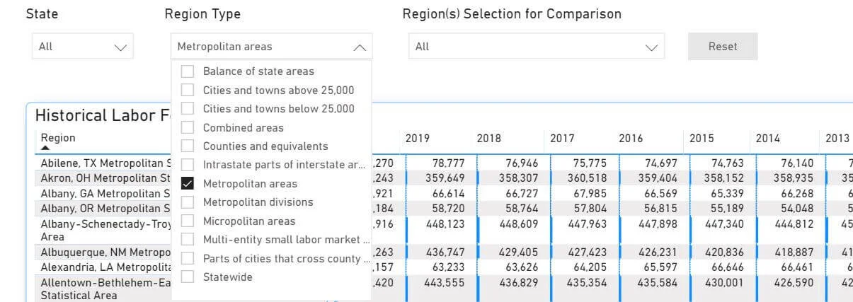
I don't want to see data for counties with a few hundred residents. I only want to see the major MSAs. Filtering here will weed out all the little cities and counties with a small sample size to calculate any meaningful data.
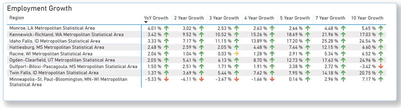
Employment Growth
You can see that MSAs are listed in alphabetical order. I first want to analyze Employment Growth, so I will select "Employment."
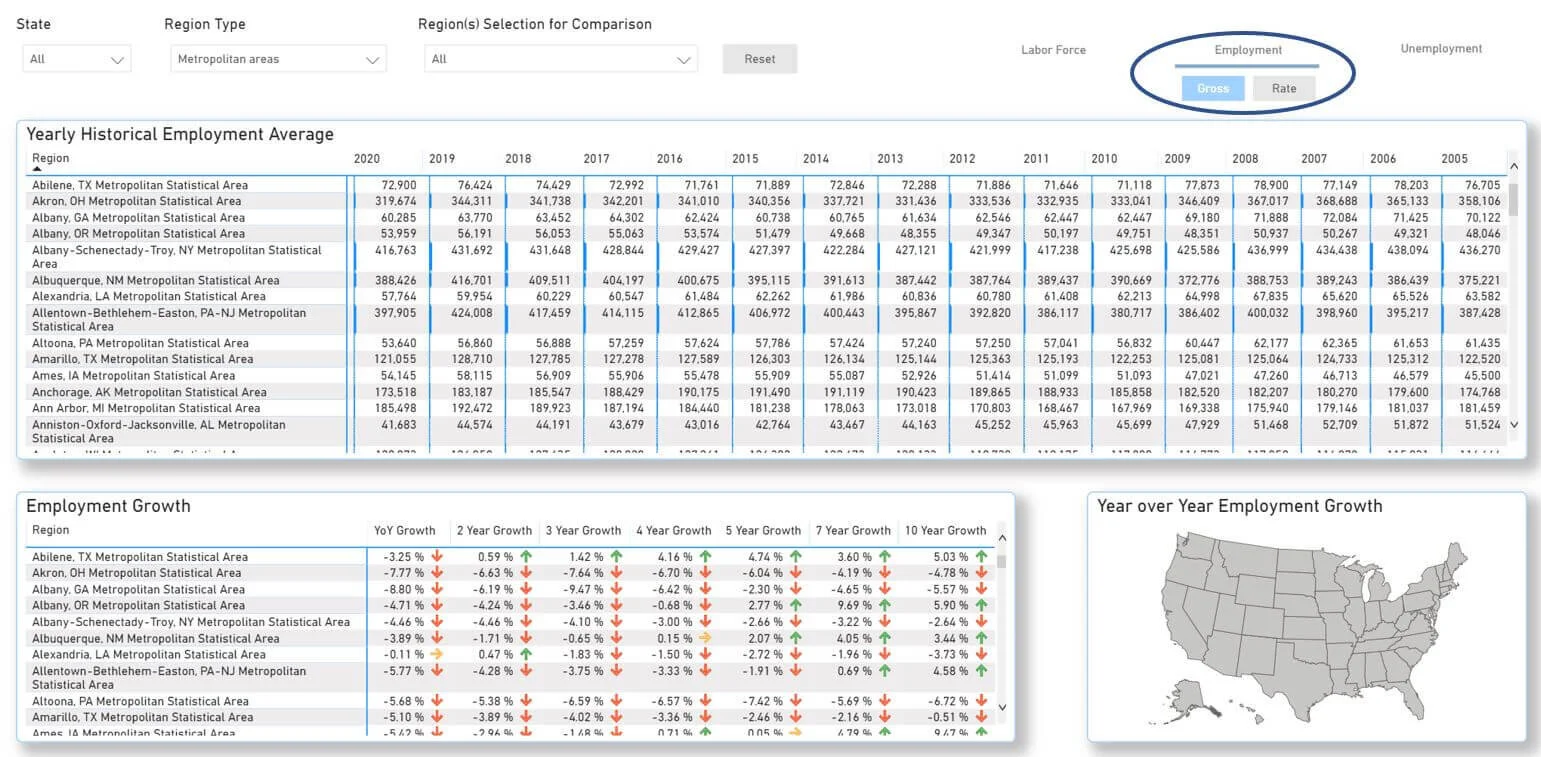
Now, I will go down to the bottom left grid and sort (by clicking the column header). The highest year-over-year data (YOY) is shown first.
Rationale: The latest data BLS was published in September 2020. The employment market in September of 2019 was strong. 2020 has been challenging due to the pandemic. Most submarkets nationwide have seen a declining employment market over the past 12 months. By filtering growth, we can see the markets that have bucked the trend and are overachieving during COVID-19.
Monroe, LA, is leading the nation in employment growth for the most recent YOY period. I took a snapshot of these MSA (the image above) and proceeded with the analysis. Employment growth is excellent, but ideally, you want to see labor force growth and low unemployment.
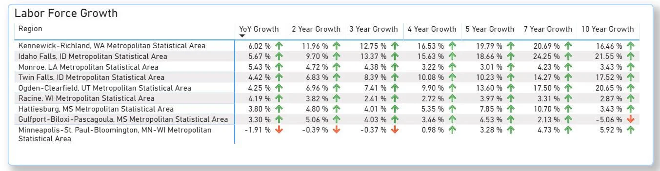
Labor Force Growth
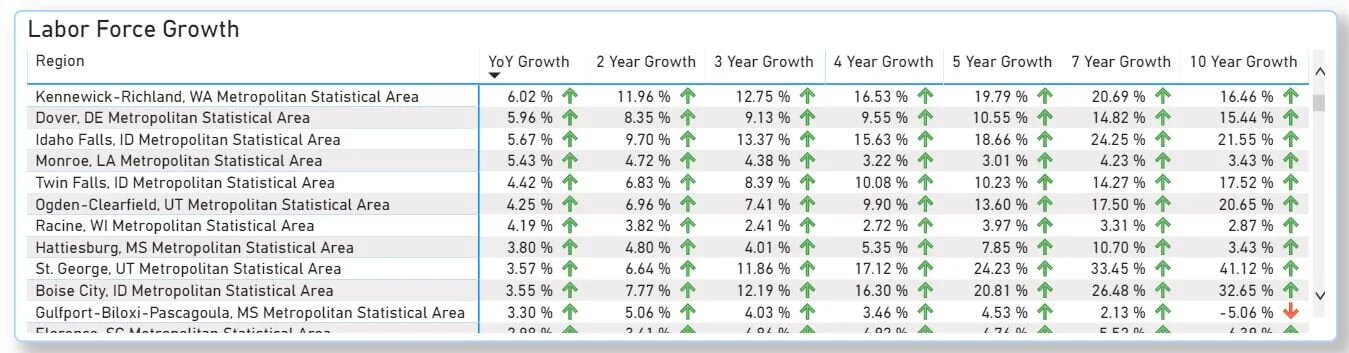
With the data already filtered from best to worst, I must click "Labor Force" on the dashboard page.

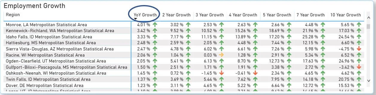
Now we can see the national leaders in YOY labor force growth.
Let now compare the Top 11 for both employment and labor force growth and jot down all the MSAs that crack the top of both. They are:
Monroe, Louisiana
Kennewick-Richland, Washington
Idaho Falls, Idaho
Hattiesburg, Mississippi
Racine, Wisconsin
Ogden-Clearfield, Utah
Gulfport-Biloxi-Pascagoula, Mississippi
Twin Falls, Idaho
Dover, Delaware
The final step is determining if each MSA's unemployment is less than the national average of 7.67% in September.

To do this, the dashboard has a nifty regional search function where we can quickly search and select all of the bulleted MSAs above.

Searching and selecting all the MSAs should take less than 30 seconds. We have effectively cut out the "fluff" of all irrelevant MSAs, and our data set focuses only on the nine MSAs we selected.
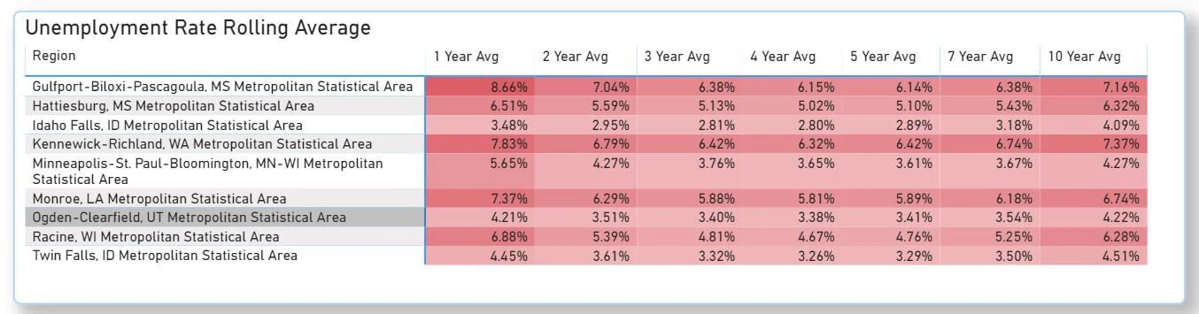
Unemployment Rate
Now click the "Unemployment" in the upper right-hand corner and the "Rate" button below it.

We can see the 2020 rolling average.

This doesn't tell us everything we need about unemployment, but it gets us close. Gulfport, Dover, Kennewick-Richland, and Monroe had higher unemployment in 2020 than the other MSAs. But this is just a rolling average. It’s averaging out all 2020 months. We need to see the actual September unemployment to compare each MSA's unemployment rate to the national average.
We do this from the "Regional Comparison" Dashboard tab.
Note: This page will default to Washington, D.C. (it saves time for the dashboard to load data). Feel free to uncheck it once you begin selecting your cities.
We will search for Gulfport, Dover, Kennewick, and Monroe. Select "Unemployment" in the upper left-hand corner and expand the 2020 data in the first column.
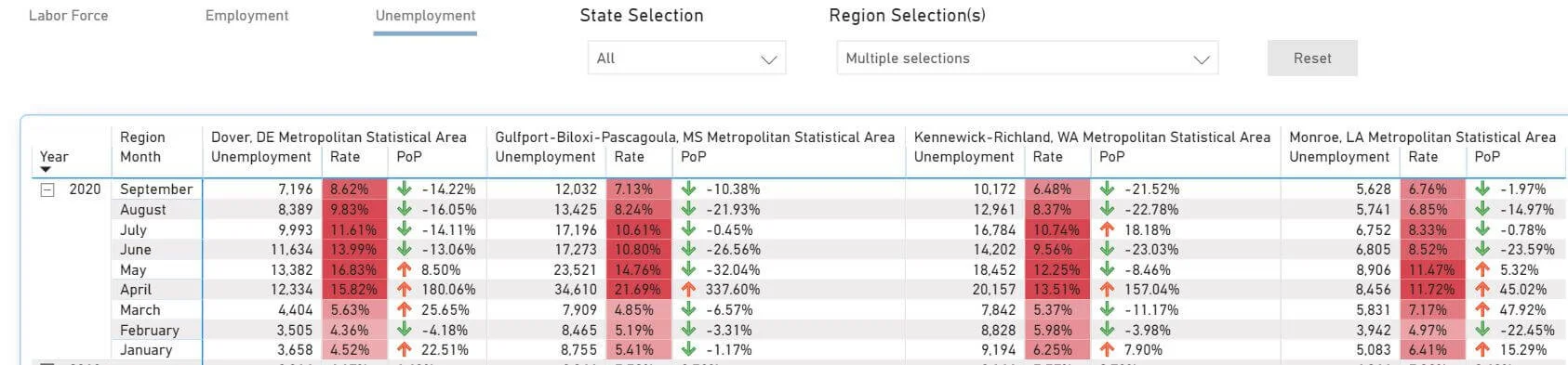
Now, we can see the unemployment data from a more granular level. All September unemployment rates are lower than the national average of 7.57%, except for Dover, Delaware. Let's remove it and widdle down the list to:
Monroe, Louisiana
Kennewick-Richland, Washington
Idaho Falls, Idaho
Hattiesburg, Mississippi
Racine, Wisconsin
Ogden-Clearfield, Utah
Gulfport-Biloxi-Pascagoula, Mississippi
Twin Falls, Idaho
Benchmark Top Cities Against a Market You’re Familiar With
Eight MSAs appear ahead of the curve in employment fundamentals. I don't have a ton of experience working in these MSAs. What I like to do next is compare unfamiliar MSAs with an MSA I am familiar with. I will use the Twin Cities, Minnesota.
This is the Minneapolis, St. Paul, and Bloomington MSA in the dashboard. Around the nation, the Twin Cities is lauded for having 16 Fortune 500 companies, including a few Healthcare behemoths (Medtronic, United Health Group, and St. Jude Medical, now absorbed by Abbott Labs). It has also been a national leader in the unemployment rate pre-Covid, offers substantial starting salaries for fledgling professionals, and exhibits moderate living costs.
I have a strong pulse on the local employment market in the Twin Cities. That will serve as an excellent benchmark to compare to. If you're more familiar with Portland, Orlando, New York City, or whatever city(s) you are knowledgeable about, drop it into the analysis!
Let’s go back to the “Historical Comparison” tab of the dashboard.
Unemployment
As I expected, The Twin Cities compares favorably to the eight MSAs. 5.65% unemployment in September is well below the national average.
Employment
When looking at YOY employment growth, the Twin Cities stand out like a sore thumb with -5.33% YOY growth. Regarding the total number of jobs, the Twin Cities are about where they were five years ago. It's interesting; our eight "bullish" markets have much momentum, adding new jobs before COVID began to impact the labor markets. I've always felt strongly that the pandemic isn't necessarily picking cities that are winners and losers; it is exacerbating the trends that were already unfolding.
Labor Force
Again, The Twin Cities is the only market that has seen a declining labor force YOY. In another blog post, I describe how a declining labor force may be the most significant factor in the Twin Cities’ declining unemployment rate. Losing labor force participants decreases the unemployment rate, which can be deceiving.
Employment & Wages in Top Metros
Now it's time to switch gears and research what is happening within the top MSAs. The "Wage Analysis" tab will dive into occupations, employment numbers, and wages in our dashboard.
Let's look at Idaho, given that Idaho Falls and Twin Falls MSAs crack our Top 8.
If you expand Idaho by clicking the little "+" sign, you can see the regional breakdown of:
Employment totals
Employment % (of state)
Average median wage
Delta between the regional median wage and state median
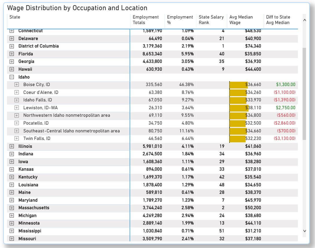
As expected, the Boise MSA leads employment totals, hosts 46.38% of the state's employees, and gets attention when discussing real estate investment in Idaho. We can go further. If we click on Twin Falls, we can see:
Employment total by occupation
Employment percentage by occupation
Median wage by occupation
Delta between median wage by occupation and median regional wage
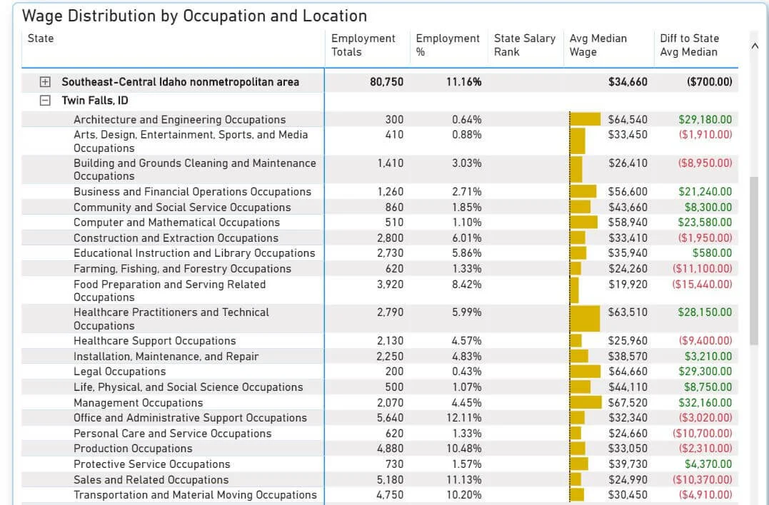
I wish BLS provided data on industries. Unfortunately, they do not! You'll need to dig for information on the composition of employment within a given sector. The Census Bureau will also provide essential submarket-specific information.
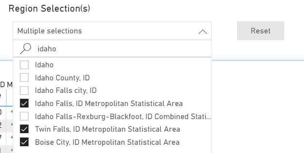
I would be curious to see how Boise, the primary employment hub of Idaho, compares to Idaho Falls and Twin Falls. Let’s go back to the “Regional Comparison” tab.
Labor Force
Historically, Boise has outpaced Idaho Falls and Twin Falls in labor force growth. Idaho Falls has been surging as of late.
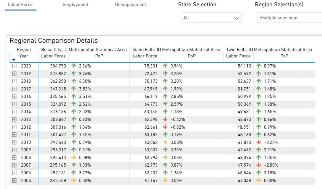
Employment
Boise had an awful April, which set it back compared to a tamer job loss in Idaho Falls and Twin Falls. Boise is still behind March 2020 employment totals, while Idaho Falls and Twin Falls have added jobs since then.
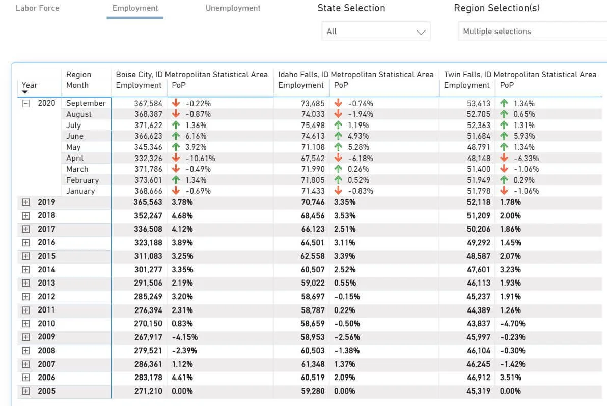
Unemployment
September Unemployment in Boise is a point higher than in Twin Falls and two points higher than in Idaho Falls.

More MSA Research
The last step I would take is to spend some time researching MSAs outside of the Dashboard. If the employment metrics check out, it'd be wise to figure out the significant industries, employers, future job outlooks (such as a proposed Amazon fulfillment center), and other prevalent socio-economic factors in a given MSA.
It may be worth logging into employment aggregators like LinkedIn or Glassdoor and perusing the job openings in your markets of interest to get a feel for the quality and quantity of work available. And don't forget to research housing affordability. Housing affordability can greatly hinder apartment development feasibility.
Summarizing Submarket Employment Analysis
This blog post uncovered eight under-the-radar MSAs whose labor markets have excelled during a global pandemic
My first analysis items are employment metrics and population trends when digging into an unfamiliar metro. As I see it, if the underlying macroeconomic fundamentals are in peril, it will be tough to justify investment in real estate over the long term and see sustained success.
On a related note, check out four submarkets struggling in the current climate or how tourist destinations are recovering from the pandemic.